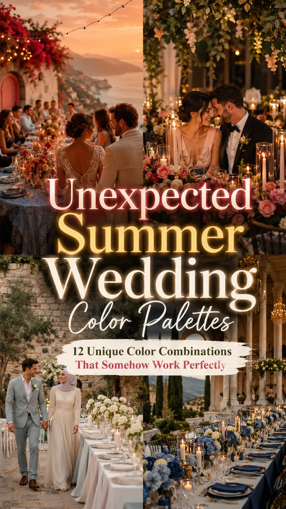
12 Unexpected Summer Wedding Color Palettes That Somehow Work Perfectly
The most unforgettable wedding color palettes are rarely the obvious ones.
Anyone can pair blush with ivory or sage with white. But the weddings people truly remember are often the ones with color combinations that initially sound unexpected — until you see them layered together in candlelight, flowers, fabric, and summer sunset lighting.
That’s the magic of modern wedding styling.
The best palettes today feel emotional instead of overly coordinated. They create atmosphere through contrast, texture, warmth, and softness rather than relying on perfectly matching colors everywhere.
And during summer, unusual combinations become even more beautiful because sunlight naturally softens and blends tones together in ways indoor lighting never can.
These unexpected summer wedding color palettes somehow work perfectly because they balance:
- warmth and depth
- softness and contrast
- romance and modernity
The result feels stylish, cinematic, and far more memorable than traditional wedding colors.
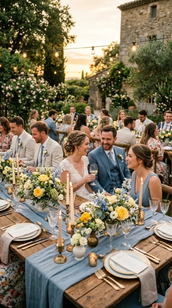
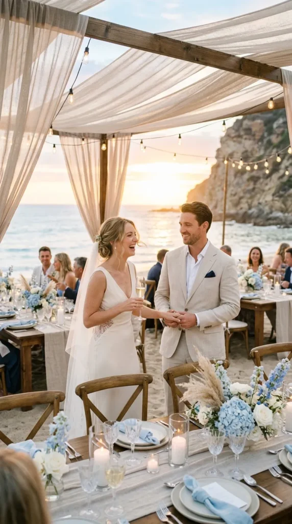
1. Butter Yellow and Dusty Blue
At first, this palette sounds almost too soft.
But together, butter yellow and dusty blue create a dreamy European-summer atmosphere that feels warm, airy, and incredibly romantic.
Picture:
- dusty blue linen
- pale yellow florals
- candlelight
- soft sunset skies
- vintage-inspired tableware
The contrast feels fresh without becoming overly playful.
Perfect for:
- garden weddings
- countryside venues
- outdoor summer dinner.
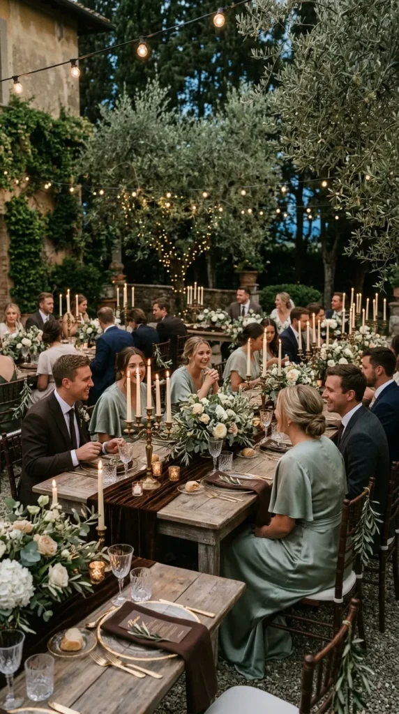
2. Chocolate Brown and Sage Green
Brown weddings are becoming unexpectedly luxurious.
When paired with muted sage green, chocolate tones feel rich, earthy, and sophisticated rather than heavy.
Use:
- olive branches
- brown velvet details
- sage bridesmaid dresses
- warm candlelight
- natural wood textures
The overall aesthetic feels grounded, modern, and quietly elegant.
Especially stunning for evening summer receptions.
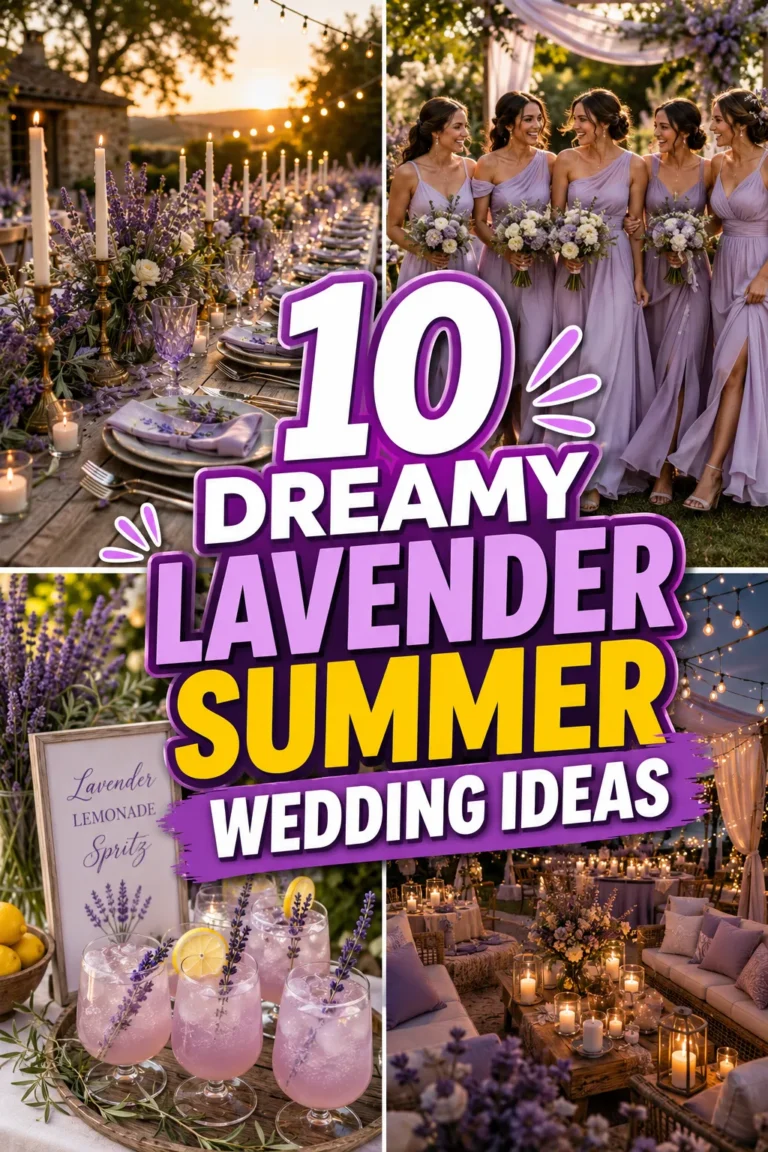
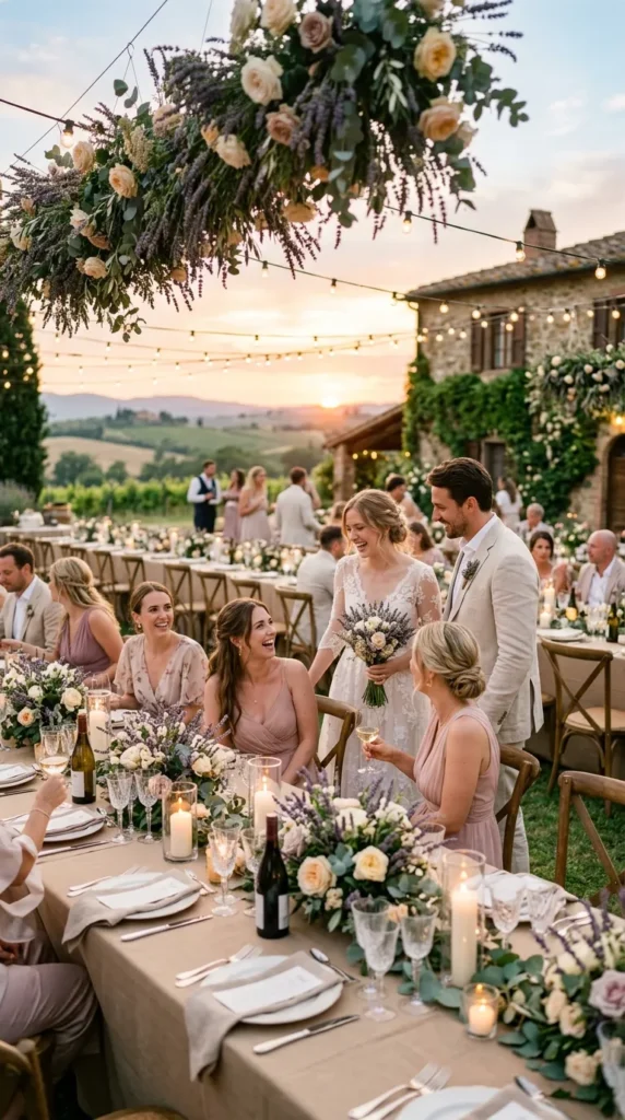
3. Lavender and Warm Beige
Lavender can sometimes feel overly pastel on its own.
But when balanced with warm beige and creamy neutrals, it suddenly becomes soft, romantic, and refined.
The warmth tones down the cool purple and creates a calming atmospheric palette perfect for:
- garden weddings
- French countryside themes
- candlelit outdoor dinners
This combination feels timeless instead of trendy.
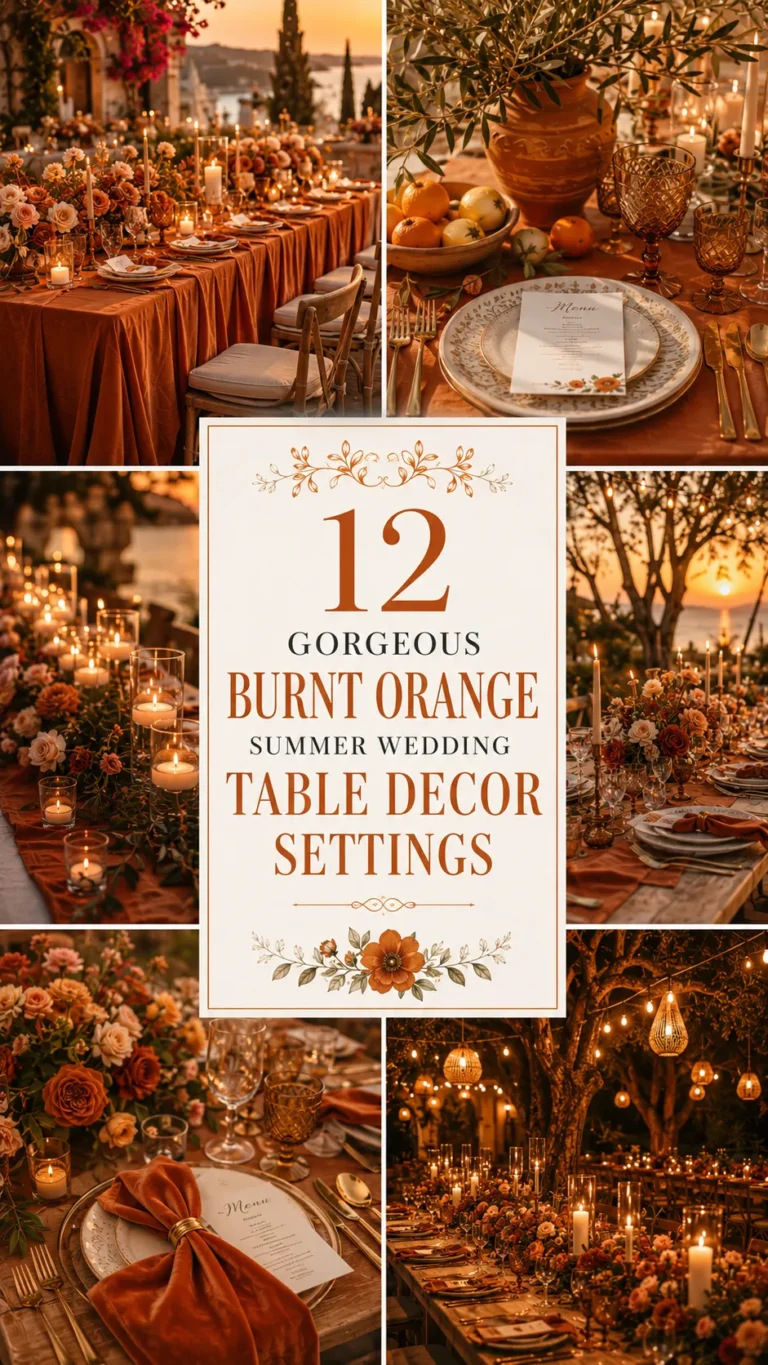
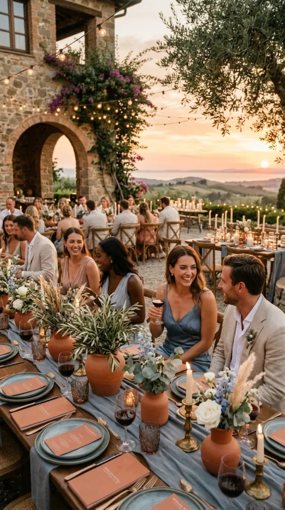
4. Terracotta and Dusty Blue
These colors shouldn’t work together — but somehow they look incredible.
The warmth of terracotta balanced against soft blue tones creates a Mediterranean-inspired palette that feels both earthy and elegant.
Think:
- clay ceramics
- blue-gray linen
- dried florals
- olive branches
- sunset lighting
The contrast feels artistic and fashion-forward without overwhelming the wedding aesthetic.
5. Olive Green and Champagne
This palette feels effortlessly expensive.
Olive green brings depth and organic texture, while champagne softens everything with warmth and light.
Use:
- champagne satin
- olive greenery
- ivory florals
- gold candlelight
- textured neutral fabrics
The result feels luxurious without looking overly formal.
Perfect for minimalist summer weddings.
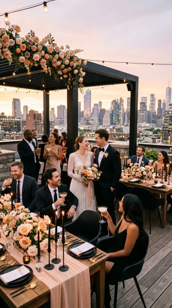
6. Soft Peach and Black
Black at a summer wedding sounds risky — until it’s paired with soft peach tones.
The contrast creates:
- sophistication
- warmth
- modern romance
- dramatic elegance
Black details ground the softness of peach and prevent the palette from feeling too sweet.
Especially beautiful for:
- rooftop weddings
- evening receptions
- modern luxury venues
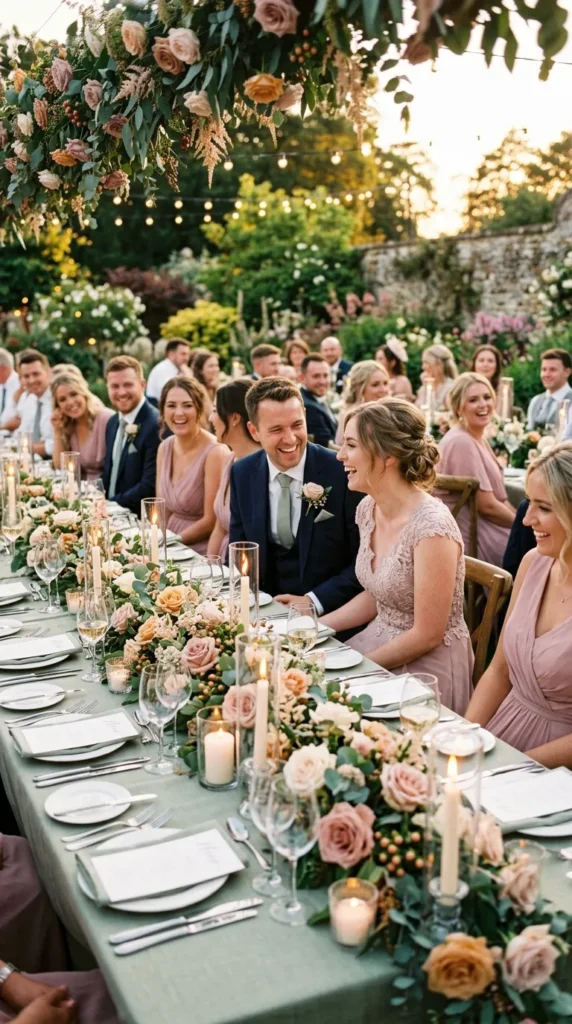
7. Sage Green and Dusty Rose
This combination works because both tones feel muted and organic.
Neither color competes for attention.
Together they create:
- softness
- femininity
- natural warmth
- romantic calmness
Add:
- linen textures
- candlelight
- garden florals
- wood details
and the palette instantly feels timeless.
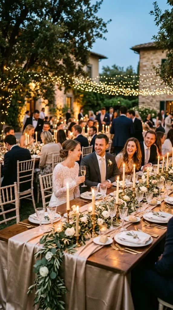
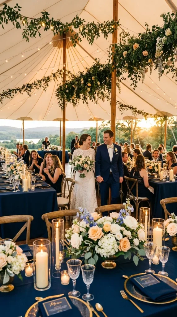
8. Navy Blue and Buttercream
Navy adds elegance. Buttercream softens it beautifully.
The combination feels:
- classic
- warm
- cinematic
- elevated
Especially during golden hour, buttery neutral tones glow against darker navy details in a way that feels incredibly luxurious.
This palette works beautifully for:
- coastal weddings
- tented receptions
- formal outdoor celebrations
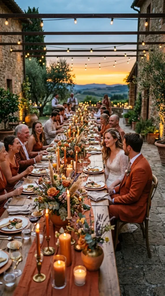
9. Rust Orange and Lavender
Unexpected? Completely.
But the warm-cool contrast creates depth that feels artistic and romantic instead of seasonal.
Use lavender sparingly through:
- florals
- stationery
- fabric accents
while allowing rust tones to dominate the atmosphere through:
- candles
- table styling
- bridesmaid dresses
- textured décor
The overall look feels editorial and fashion-inspired.
10. Ice Blue and Soft Sand
This palette feels calm, coastal, and incredibly modern.
Ice blue prevents neutral sand tones from becoming too warm, while sandy textures soften the coolness of blue.
Together they create:
- quiet luxury
- airy elegance
- beachside sophistication
Perfect for:
- destination weddings
- oceanfront venues
- minimalist summer styling
11. Emerald Green and Blush Pink
Emerald may sound too bold for summer, but blush softens it into something romantic and dramatic at the same time.
Use emerald selectively:
- velvet ribbons
- glassware
- menus
- lounge accents
Then balance it with:
- blush florals
- pale fabrics
- candlelight
- soft textures
The palette feels luxurious and unforgettable at night.
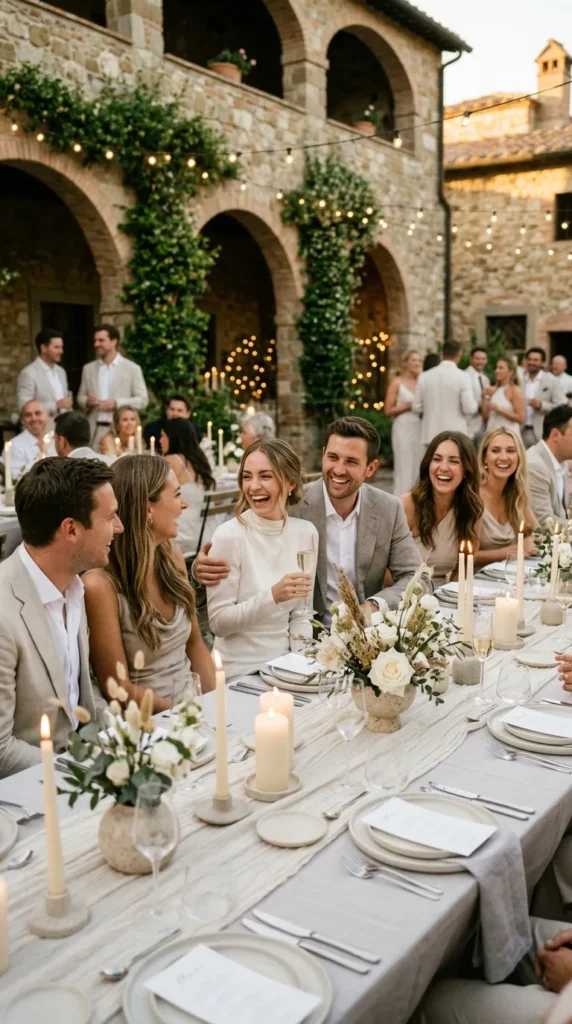
12. Ivory, Stone, and Pale Gray
Sometimes the most unexpected palette is barely using color at all.
Layering:
- warm ivory
- stone beige
- pale gray
- soft candlelight
- natural linen
creates a minimalist atmosphere that feels calm, architectural, and incredibly expensive.
The magic comes from texture and lighting rather than bright color.
This palette proves quiet styling often creates the strongest emotional impact.
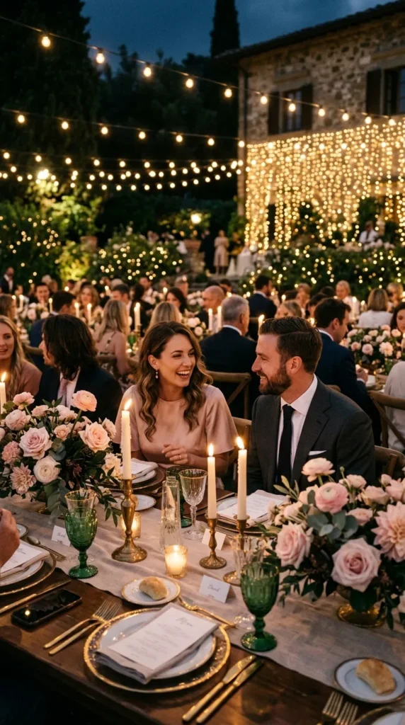
Final Thoughts
The best wedding color palettes aren’t always the most obvious ones.
Unexpected combinations often feel more emotional, memorable, and visually layered because they create contrast and atmosphere naturally.
Summer weddings especially allow unusual tones to shine beautifully thanks to:
- golden sunlight
- outdoor settings
- candlelit evenings
- airy textures
- natural movement
The key is balance.
When colors complement emotion, lighting, and texture instead of competing for attention, even the most unexpected palette can feel absolutely perfect.