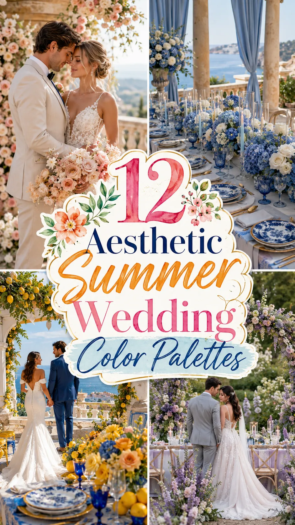
12 Aesthetic Summer Wedding Color Palettes That Look Luxuriously Expensive
Luxury isn’t always about spending more.
Sometimes, it’s simply about choosing the right colors.
The world’s most elegant weddings rarely rely on loud palettes or trendy combinations that will feel dated in a few years. Instead, they use thoughtfully layered tones that create depth, harmony, and a sense of effortless sophistication.
That’s what makes a color palette feel expensive.
It’s not about using gold on everything.
It’s about restraint.
Soft contrasts.
Unexpected pairings.
And colors that make every flower, fabric, and candle look elevated.
Whether you’re planning a coastal celebration, an Italian villa wedding, or a romantic garden reception, these palettes prove that color alone can transform the entire atmosphere.
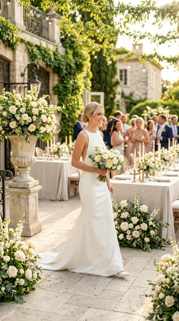
1. Buttercream, Oyster & Warm Taupe
Forget stark white.
Layer creamy butter tones with oyster and warm taupe for a palette that feels straight out of a luxury boutique hotel.
Style it with:
- textured linen
- ivory roses
- travertine details
- soft candlelight
The result is quiet luxury at its finest.
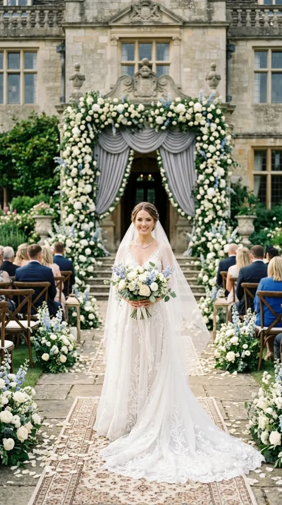
2. Bluebell, French Gray & Antique Ivory
Instead of bright blue, choose soft bluebell paired with muted French gray and antique ivory.
The combination feels:
- refined
- timeless
- effortlessly European
Perfect for estate weddings and historic venues.
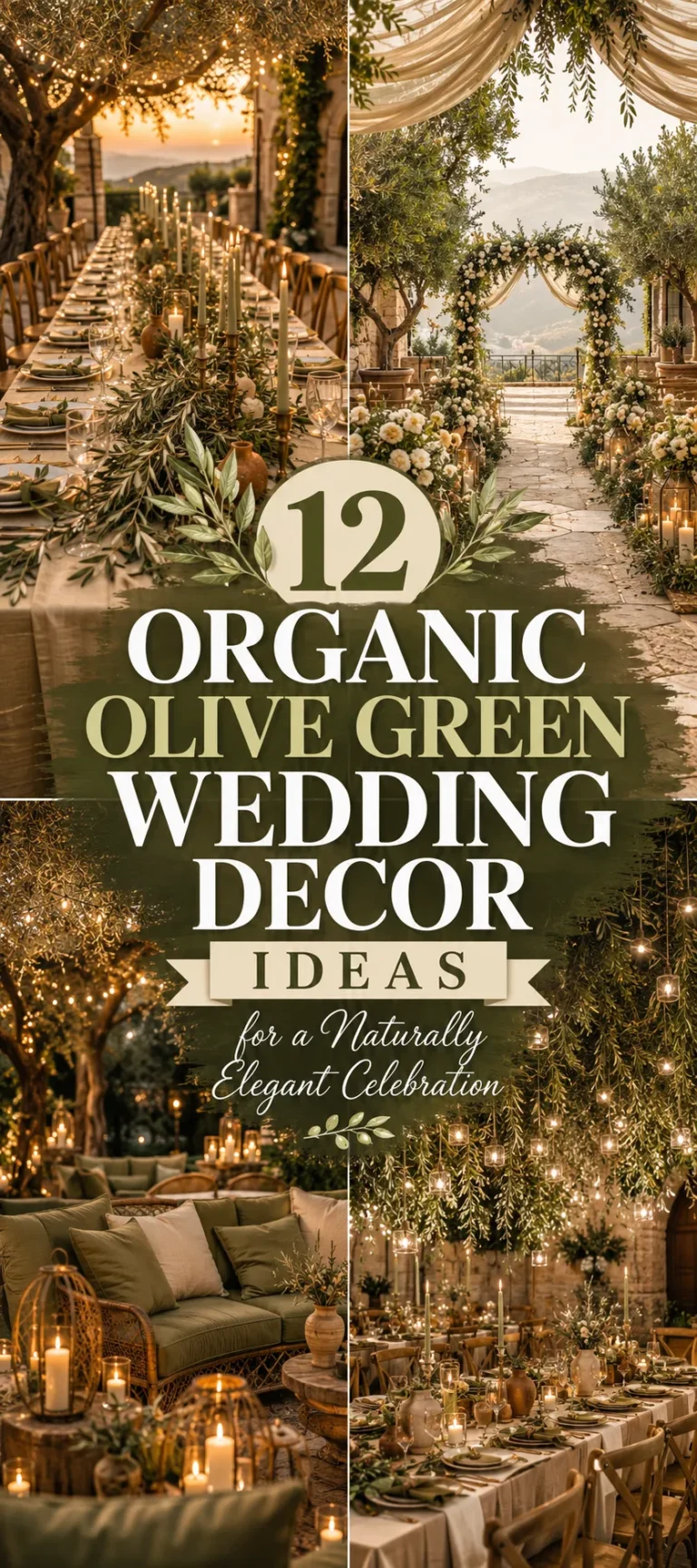
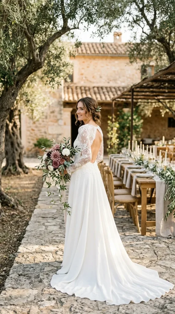
3. Olive, Stone & Soft Fig
This palette takes inspiration from Mediterranean landscapes.
Think:
- olive branches
- limestone architecture
- ripe figs
- natural stone
Everything feels organic, understated, and incredibly elegant.
4. Mocha, Champagne & Dusty Peach
Warm neutrals are replacing cool tones in luxury wedding design.
Mocha table linens, champagne satin, and dusty peach flowers create a layered palette with remarkable depth.
It’s soft without being boring.
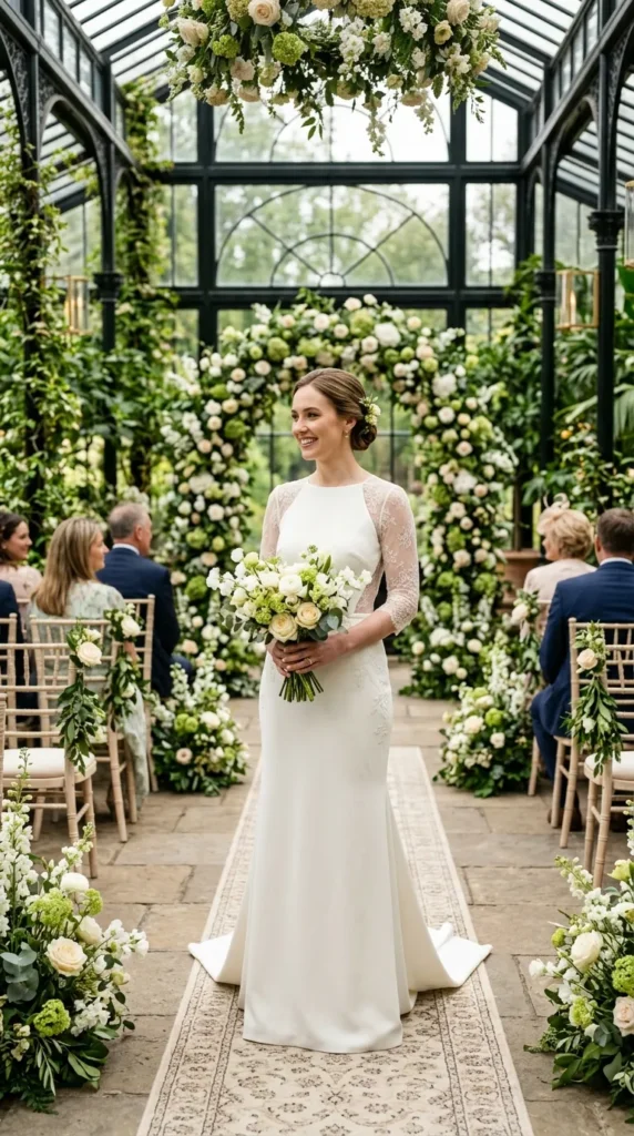
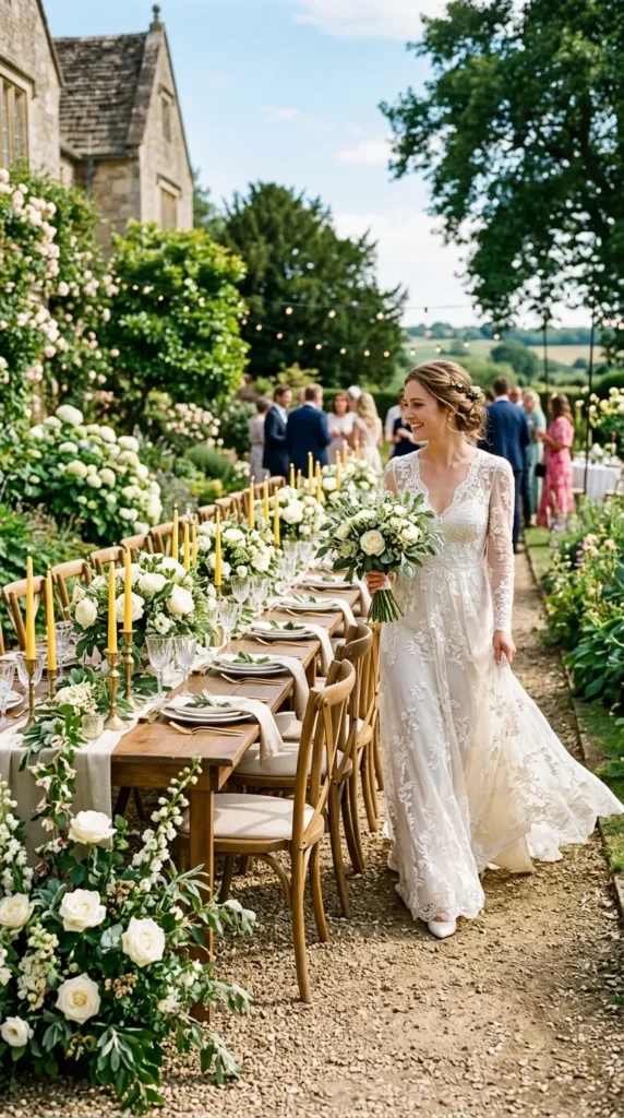
5. Pistachio, Cream & Soft Gold
Green has become the new neutral.
Pistachio paired with cream and brushed gold creates a fresh, sophisticated look that feels modern yet timeless.
Ideal for:
- garden weddings
- glasshouse venues
- outdoor receptions
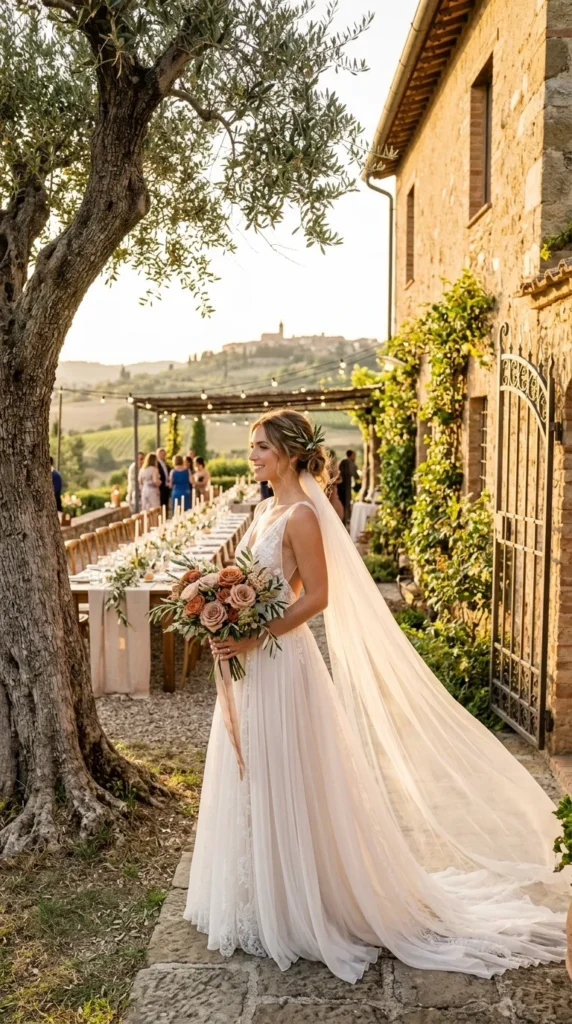
6. Cinnamon Rose, Sand & Olive
Instead of traditional blush pink, cinnamon rose introduces warmth and richness.
Combined with sandy neutrals and olive green, the palette feels inspired by a luxurious Italian countryside wedding.
It’s romantic without being overly sweet.
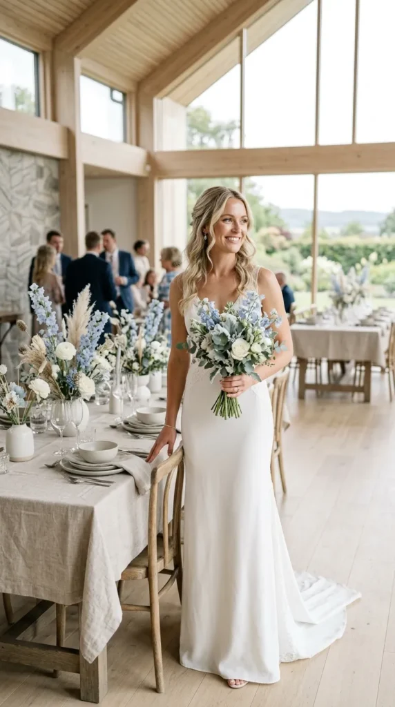
7. Smoke Blue, Linen & Weathered Oak
Inspired by Scandinavian interiors, this palette embraces calm sophistication.
Picture:
- pale blue florals
- natural oak tables
- flax-colored linens
- handmade ceramics
Every detail feels intentional.
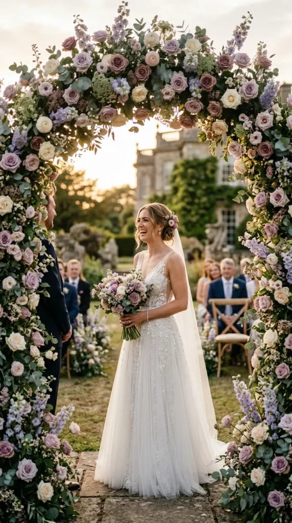
8. Plum, Dusty Lavender & Warm Ivory
Purple is returning—but in a softer, moodier way.
Muted plum and dusty lavender add quiet drama while warm ivory keeps the palette balanced.
Beautiful for sunset receptions.
9. Sage, Butter Yellow & Natural White
One of the freshest combinations for summer.
Instead of bold contrast, this palette layers gentle color transitions.
Fresh herbs, butter-colored candles, and white flowers create a celebration that feels naturally luxurious.
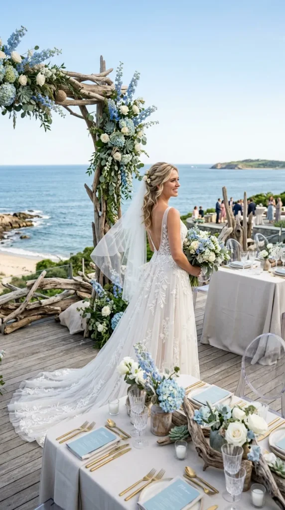
10. Sea Glass, Oyster & Driftwood
Coastal weddings don’t need turquoise.
This refined palette draws inspiration from weathered shorelines instead.
Think:
- frosted sea glass
- oyster shells
- pale driftwood
- misty blues
Sophisticated, subtle, and effortlessly elegant.
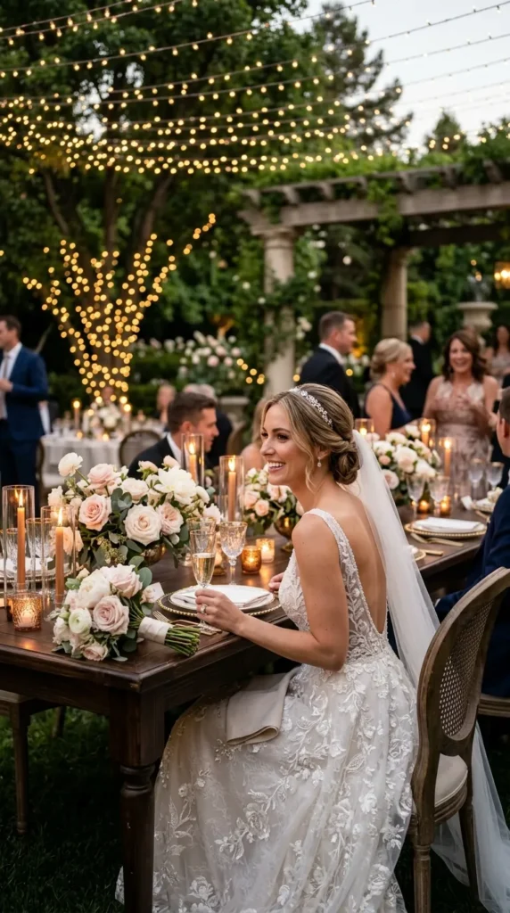
11. Espresso, Caramel & Soft Blush
Dark tones can absolutely work in summer.
Used sparingly, espresso adds richness while caramel and blush soften the overall look.
Perfect for evening receptions beneath string lights.
The contrast feels editorial.
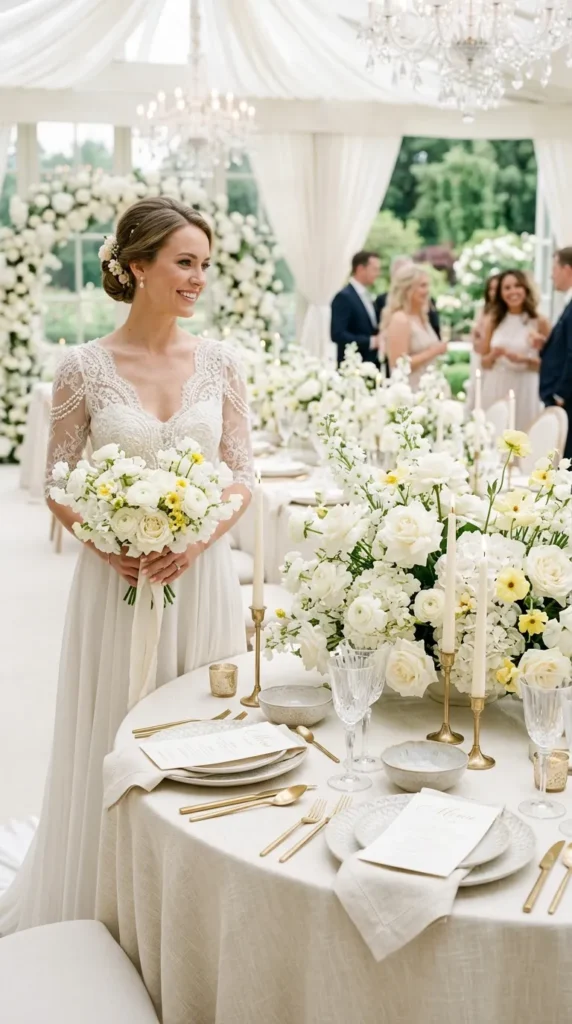
12. Layered Whites with One Signature Color
The most expensive-looking weddings often rely on a surprisingly simple formula.
Imagine:
- ivory florals
- cream linens
- pearl candles
- white stoneware
- soft textures everywhere
Then introduce just one carefully chosen accent:
- butter yellow
- bluebell
- olive
- cinnamon rose
Instead of competing colors, every detail supports one another.
The overall effect feels calm, curated, and impossibly elegant.
Sometimes, luxury isn’t created by adding more.
It’s created by knowing exactly when to stop.
Final Thoughts
A truly luxurious wedding palette isn’t defined by trends—it’s defined by balance.
The most elegant celebrations combine:
- layered neutrals
- softened colors
- natural textures
- subtle contrast
- timeless pairings
to create a look that feels refined in every photograph.
Because expensive-looking wedding design isn’t about choosing the boldest colors.
It’s about choosing the right ones—and letting them speak quietly.